9 Best Practices to Design Dashboards for Optimal Data Visualization

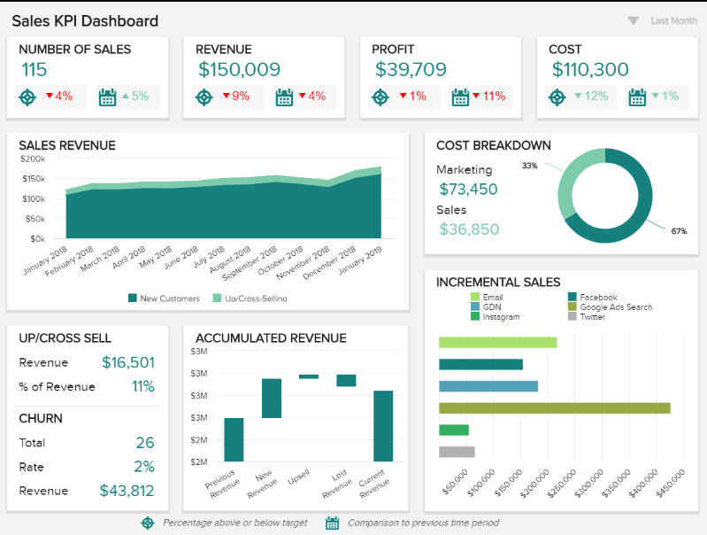
Designing dashboards for optimal data visualization is crucial for effectively conveying information and insights to users. Here are nine best practices to help you create dashboards that are informative, user-friendly, and visually appealing:
- Define Clear Objectives:
- Start by defining the purpose of your dashboard and the specific goals it needs to achieve. Understand the key questions your users want to answer and what insights they need.
- Prioritize Key Metrics:
- Focus on displaying the most critical metrics and KPIs that align with your objectives. Avoid cluttering the dashboard with unnecessary data points.
- Choose the Right Visualization Types:
- Select appropriate chart types and visualizations for each data element. Common choices include bar charts, line charts, pie charts, and heatmaps. Use scatter plots, bubble charts, or maps for spatial data.
- Maintain Consistency:
- Ensure a consistent design and layout throughout the dashboard. Use a standardized color palette, font, and formatting to make the dashboard visually coherent.
- Keep It Simple:
- Avoid unnecessary complexity. Simplify data representations and use clear labels, titles, and legends to make it easy for users to understand the information.
- Use Interactive Features:
- Implement interactive elements like filters, dropdowns, and sliders to allow users to explore the data and customize their views. Interactivity enhances user engagement and understanding.
- Prioritize User Experience:
- Design with the end-users in mind. Consider their needs, preferences, and expertise level. Create an intuitive interface that guides users through the dashboard effortlessly.
- Provide Context and Annotations:
- Add context to your visualizations through annotations, tooltips, and captions. Explain the significance of data points, trends, or anomalies to aid interpretation.
- Test and Iterate:
- Continuously gather feedback from users and stakeholders to refine your dashboard. Conduct usability testing to identify pain points and areas for improvement, and make necessary adjustments.
Bonus Tip: Responsiveness:
- Ensure your dashboard is responsive and can adapt to different screen sizes and devices. This ensures a seamless user experience across desktop, tablet, and mobile devices.
By following these best practices, you can create dashboards that effectively communicate insights, support data-driven decision-making, and enhance the overall user experience. Remember that the specific needs of your users and the nature of your data should always guide your design choices.


